Project Management & Consulting Services
Services
- Brand strategy
- Logo design
- Style Guide + Collateral
- Website design
- Website Development
- Copywriting
- Marketing Strategy
- Campaign Launch
About NGNU
NGNU is a project management company that delivers services that are brave, customer experiences that are bold, and social outcomes that are both.
With a unique position in the industry as an Aboriginal owned organisation, they were after a new look that showcased their roots and heritage while also being relevant and meaningful to their clients.


The design challenge
As a proudly indigenous-owned organisation, with a strong focus on social responsibility and giving back in the form of creating pathways for indigenous youth, NGNU had a unique brand presence in the project management industry.
The problem was it didn’t capture the other side of their business – the focused, experienced, results driven team that would constantly go beyond to deliver successful project management outcomes.
Our team was tasked with this challenge – how to create a professional, current, recognisable and striking brand that still reflected and referenced their history and deeper purpose.
The Solution
We worked incredibly hard, in deep collaboration with NGNU to strike the perfect balance between their indigenous foundation and their future plans for expansion and growth.
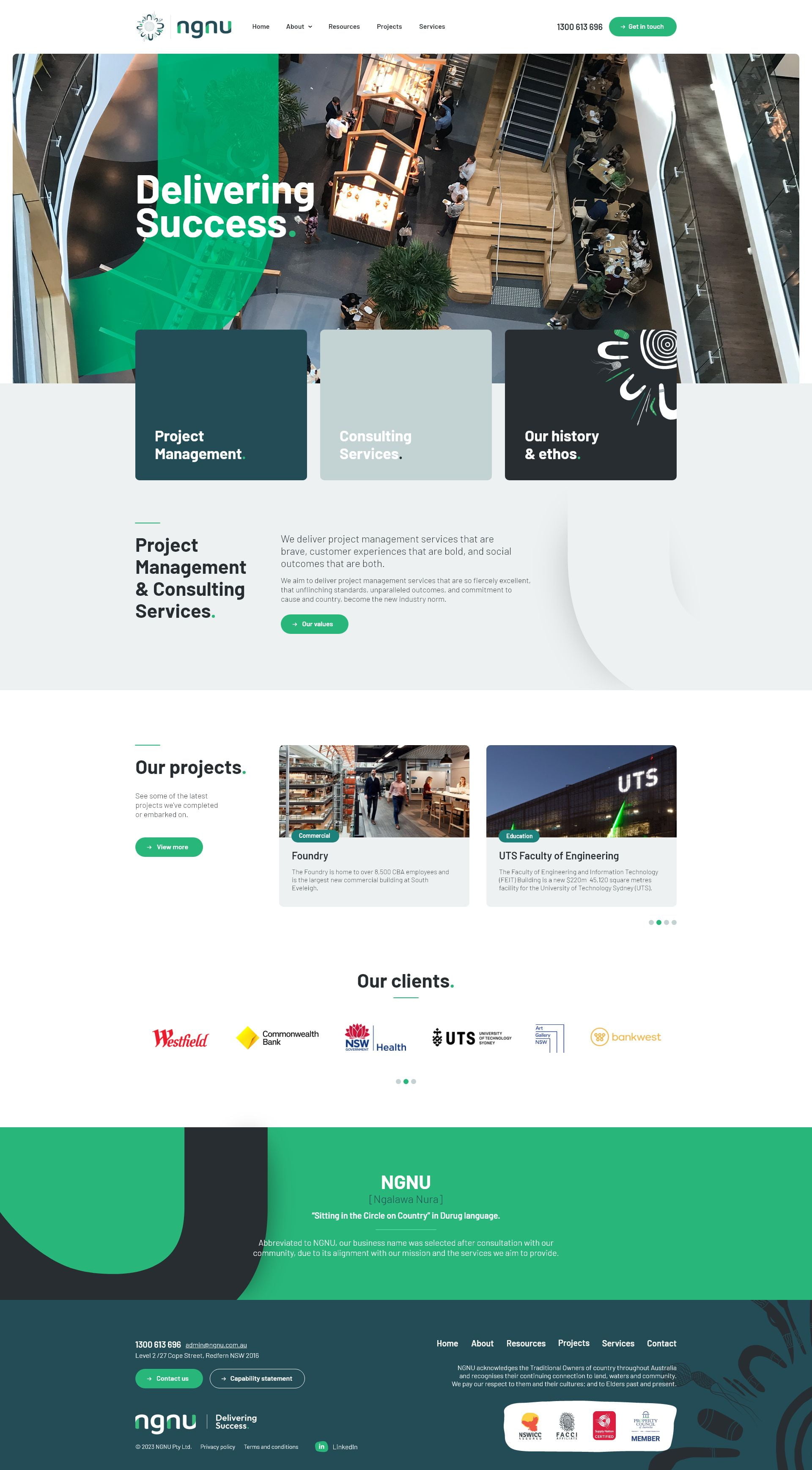
This included a lot of consideration of their values and unique brand positioning as well as how their new logo, website and marketing should appear visually.
The logo we landed on was was the culmination of a lot of deep brand identity work, which their team (and ours!) are incredibly proud of.
The NGNU flow
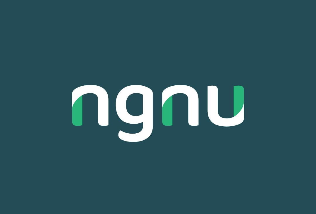
The logo elements work together to create a feeling of flow and connectedness. It is also designed to represent the motion of a snake – Snakes have been used as a symbol of strength, creativity and continuity within indigenous communities since ancient times.
Shapes from the original sitting in the circle on country graphic have been represented by the contrasting curved shapes within the NGNU letters.
“We absolutely love working with the Firesauce team! Between their deep sector expertise and their incredible energy, it makes taking on such a daunting task fun and exciting.
We undertook a complete name change, branding, collateral, website and everything in between. The team are extremely flexible to work with, and at all times find the perfect balance between driving an outcome and providing the space for you to make these big decisions.”


The outcome
The NGNU brand speaks for itself really, but the feedback from clients, suppliers, mentors and colleagues alike has been a testament to the work that went into bringing this rebrand to life! On top of that:
- The team have grown from 5 staff to 25+ since their rebrand
- They've won a slew of awards, including 5 in 2025
- They've doubled their average project size